

What Truly Makes a Great Wallpaper? (It’s More Than Just Pretty Pixels)
You look at it maybe a hundred times a day. It’s the first thing you see when you wake up and check your phone, and it’s the last thing staring back at you before you shut down your PC after a long grind. It’s your wallpaper.
But have you ever stopped to think about what actually makes a wallpaper great?
Most people just right-click, "Set as Desktop Background," and forget about it. But there is a science—and a bit of art—to choosing the image that lives behind your icons. A great wallpaper isn't just a high-resolution photo; it is digital furniture. It sets the mood, defines your space, and honestly, it can change how you feel about the device your holding.
In this deep dive, were going to explore the psychology, the design mechanics, and the technical specs that separate a "meh" background from a masterpiece. We’ll look at why some images work perfectly on a phone but fail on a desktop, and how to find the perfect visual anchor for your digital life.
The Psychology of the Screen: Why We Choose What We Choose
Before we get into pixel density and aspect ratios, lets talk about the brain. Why do we even bother changing the default background?
It’s about ownership. When you buy a device, it’s a cold, factory-reset slate. Changing the wallpaper is the digital equivalent of painting the walls in a new apartment. It claims the space. But a great wallpaper goes further—it acts as a "Mood Anchor."
Research into environmental psychology suggests that our surroundings influence our cognitive load. If your digital environment is chaotic, your brain has to work harder to focus. This is where semantic SEO comes into play—people search for "calming wallpapers" or "productivity backgrounds" because they are subconsciously trying to hack their own mood.
Visual Noise vs. Cognitive Load
A great wallpaper manages "visual noise." If an image is too busy—too many sharp lines, too much high-contrast texture all over the place—your icons get lost. You get "Icon Blindness." You stare at the screen looking for Chrome or Spotify, and you cant find it because it’s camouflaged against a noisy background.
The best wallpapers have negative space. This is the empty or low-detail breathing room where your eyes can rest, and where your icons can live legibly.
The Technical "Unforgivables": Resolution and Quality
Okay, lets get technical for a second. You can have the most beautiful photo of a sunset in the world, but if it’s 720p and you stretch it across a 4K monitor, it’s gonna look like trash.
The PPI Factor (Pixels Per Inch)
A great wallpaper must match or exceed the native resolution of your display. But it’s not just about total pixels; it’s about density.
For Phones: You are holding the screen six inches from your face. You need incredible pixel density. This is why 4K phone wallpapers are becoming the standard, even if the screen isn't technically 4K. The downscaling makes it look crisp.
For Desktops: It’s about vastness. You need an image that doesn't break down when it’s stretched wide.
If you are looking for that crispness, you need to verify the source. For instance, checking out a dedicated collection like
Compression Artifacts
Nothing ruins a wallpaper faster than JPEG artifacts—those little blocky squares that appear in gradients (like a blue sky) when an image is over-compressed. A great wallpaper uses high-quality file formats (like low-compression JPG or PNG) to keep the gradients smooth. If you see "banding" in the sky of your wallpaper, it’s time to change it.
Genre Specifics: Finding Your Vibe
Different genres serve different purposes. What makes a wallpaper "great" depends entirely on who you are and what you need that screen to do for you.
1. The Fandom Power-Up (Anime and Gaming)
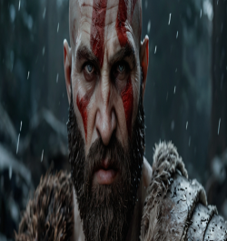
For gamers and anime fans, the wallpaper is a badge of honor. It’s a signal of what world you’d rather be living in. But there is a trap here. Game screenshots often make terrible wallpapers because of UI elements (health bars, maps).
A great gaming wallpaper is usually "clean"—art specifically designed without the game’s HUD. Take something like Attack on Titan. It’s chaotic, intense, and emotional. A good wallpaper captures that energy without being messy.
If you have a gaming rig, especially a dual-monitor setup, you need something epic that spans the width. This is where high-definition collections shine. You can find some stellar examples in the
2. The Motivation Station (Typography and Quotes)
Sometimes, you don't need a picture; you need a kick in the pants.
Text-based wallpapers are tricky. If the font is too hard to read, it’s annoying. If the background behind the text is too bright, it hurts your eyes. A great typographic wallpaper uses high contrast—usually white text on a dark background or vice versa—and centers the message so it’s not covered by your taskbar.
These are perfect for work laptops. When you minimize your browser to slack off, the screen yells at you to get back to work. For high-res text that doesn't look blurry (which is the worst), check out the
3. The Dream Machine (Automotive and Luxury)
Why do we put cars on our desktops? It’s visualization. A great car wallpaper isn't just a picture of a car; it’s a picture of engineering perfection. It’s about lighting—the way the neon city lights reflect off the hood of a Mustang, or the aggressive shadow of a grille.
For car enthusiasts, the "greatness" comes from the detail. Can you see the texture of the tire tread? Can you see the stitching on the seats if it’s an interior shot?
For example, look at the lighting in this
Composition: The "F-Pattern" and Icon Management
This is the secret sauce that designers know but users rarely think about. We read screens in an "F-Pattern" (top left, across, then down the left side). This is also where Windows and Mac default to placing icons.
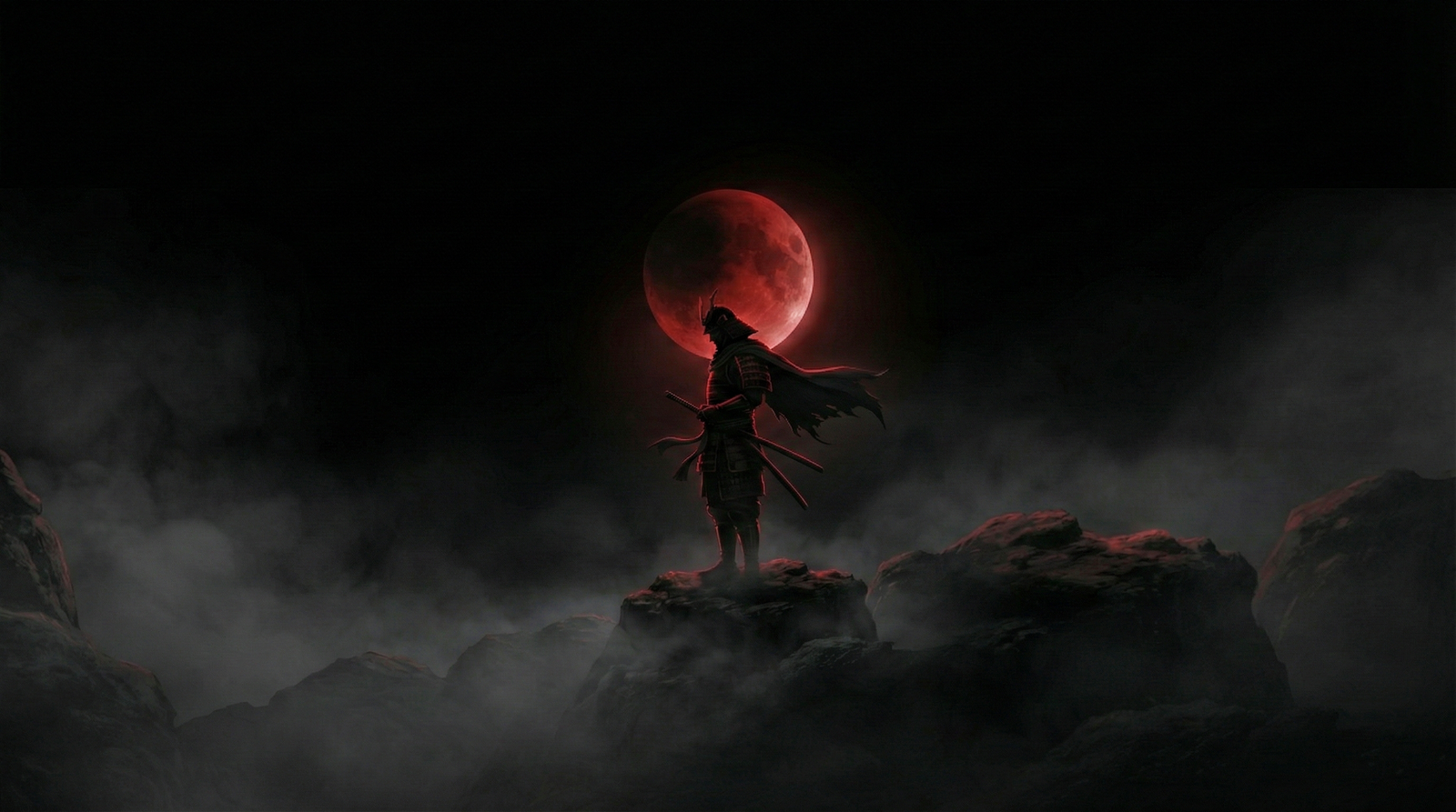
A bad wallpaper puts the most interesting part of the image (like a face or a logo) right in the top-left corner. Boom, covered by the "Recycle Bin." A great wallpaper accounts for this. It puts the main subject on the right side (for desktops) or the center-bottom (for phones). This is "Safe Zone" composition.
Desktop: Subject on the right, negative space on the left.
Mobile: Subject in the middle (below the clock) or bottom, keeping the top clear for widgets and time.
When you browse through
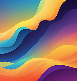
Color Theory: Dark Mode vs. Light Mode
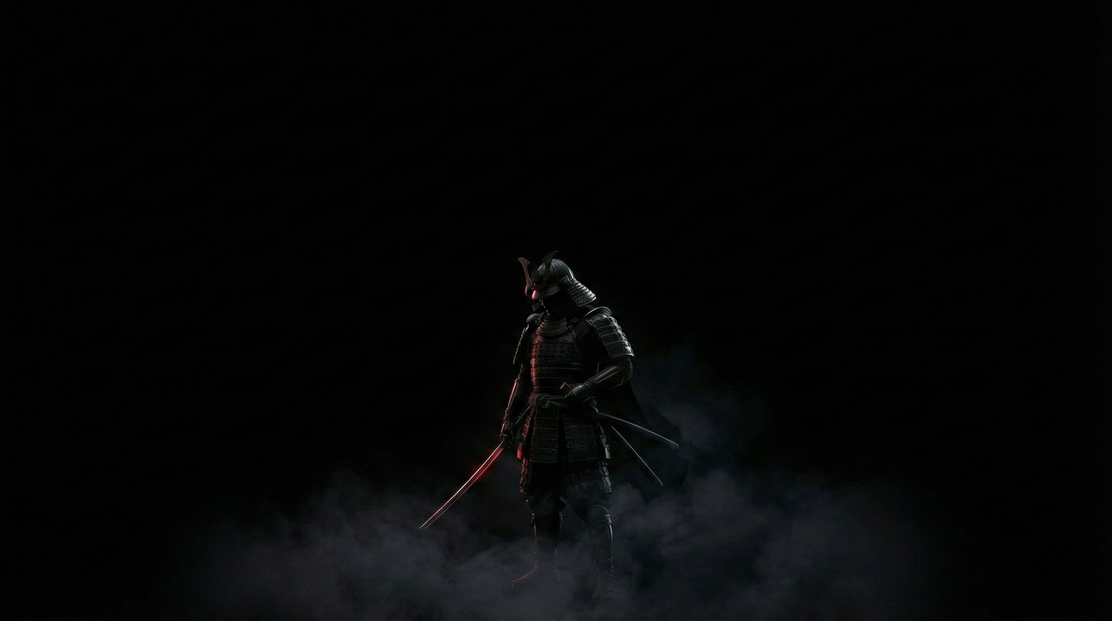
The rise of OLED screens has changed what makes a wallpaper great. If you have a modern smartphone or a high-end monitor, "True Black" wallpapers are technically superior. On an OLED screen, a black pixel is actually turned off. This means a wallpaper that is mostly black actually saves battery life.
Warm Colors (Red, Orange, Yellow): Stimulate energy. Good for fitness motivation or high-energy gaming vibes.
Cool Colors (Blue, Green, Purple): Promote focus and calm. These are usually the best for work environments because they don't fatigue the eyes as quickly.
Also, consider the time of day. A blindingly white wallpaper is great at 2 PM but feels like a flashbang grenade at 2 AM. This is why dynamic wallpapers or darker, moodier edits generally rank higher in user satisfaction over long periods.
Finding the Hidden Gems
So, where do you find these? Google Images is a minefield of low-res, stolen, and watermarked garbage. You need curated sources.
The problem with generic search engines is they don't filter for "intent." They just look for filenames. A dedicated stock site, however, categorizes by vibe, color, and resolution.
You can filter exactly what you need. If you want to dive into the deep end, use the
The Semantic SEO of Wallpapers (What the Data Says)
Interestingly, search trends show a shift. People aren't just searching "wallpaper" anymore. They search for "aesthetic minimalist wallpaper 4k" or "cyberpunk dual monitor background." This tells us that users are becoming more sophisticated. They know what they want. A great wallpaper meets these specific "long-tail" needs. It’s not generic; it’s specific.
It’s not just "Anime"; it’s Attack on Titan Season 4 Levi Ackerman.
It’s not just "Car"; it’s 2025 Mustang Dark Horse. Specifics matter. The more specific the image, the deeper the connection the user feels to it.
How to Test if a Wallpaper is "The One"
Here is a quick 3-step test you can do before you commit to a wallpaper for the long haul:
The Squint Test: Squint your eyes at the image. Does it turn into a muddy blob of grey, or can you still see distinct shapes and colors? If it gets muddy, it lacks contrast and will look boring after a week.
The Icon Simulation: Imagine a grid of folders over the image. Will you be able to read the text "New Folder (2)"? If the background is white clouds, white text will disappear.
The Emotional Check: Does it make you happy? Does it make you feel cool? Or does it stress you out?
Conclusion: It’s Your World
At the end of the day, what makes a great wallpaper is personal. But the best ones share those universal traits: high resolution, smart composition that respects your icons, and a subject matter that resonates with your interests—whether that's the Titan-slaying intensity of anime, the driven focus of a motivational quote, or the sleek lines of a Mustang.
Don't settle for the default Windows hills or the Mac abstract swirls. Your screen is the window through which you view the digital world. Make sure the view is worth looking at.
Go explore. Dig through the
Quick Summary for the Skimmers (FAQ)
Q: What resolution do I need for a PC wallpaper? A: Aim for at least 1920x1080 (Full HD). ideally, go for 3840x2160 (4K) to future-proof your look and ensure sharpness on larger monitors.
Q: Why do my wallpapers look blurry on my phone?
A: You likely used a horizontal (desktop) image on a vertical screen, forcing the phone to zoom in and crop, which kills the quality. Use dedicated mobile collections like the
Q: Does wallpaper color affect productivity? A: Yes! Blue and green tones are scientifically proven to help with focus and reduce eye strain, while bright reds can increase alertness (but also anxiety).
Q: Where can I find specific car wallpapers?
A: Check specialized image pages like the